New Client Alert! Arron Bell and Tracey Rogers are the new team behind the rebirth of historic Redhawk Vineyard, and the launch RH Estate Wines. We were lucky to have the opportunity to work with them on a full rebrand of Redhawk Labels, as well as a reimagining of the famous Grateful Red label package. We also developed a new RH Estate brand for the new overarching company, with packaging and labels to follow next year.

Sometimes a wine is so special, that it demands a label that can act as a kind of lense focused on the flavors and nuances of the wine inside. The design of these labels was developed to do just that. Putting a golden frame around the artwork of the label is a way to suggest the extra attention these wines deserve. Simple, elegant, timeless.

Who wouldn’t want to work on a project that combines wine, cute dogs, and the Bahamas? That’s just what this client is all about. The name is derived from the Royal Bahamian Potcake breed of dog, unique to the Bahamaian Islands. The winery has a two-fold mission – produce great wine and help this special breed by providing care and forever homes. We developed a new logo and identity system, as well as a full packaging system including labels, boxes, corks,etc.
We also developed a secondary label for a No Collars offshoot brand. Named after their boat, the No Collars brand is an approachable, easy drinking wine that’s designed to reflect the bahamian vibe… relaxed, laid back, and fun.

To celebrate their famed LoneStar Vineyard, Argyle Winery asked us to work on a very special project. A commemorative label and custom wooden box that would be made available to special customers, and revealed during a day long celebration. The label, borrowing from both the name of vineyard, as well as the deep Texas roots of winemaker Rollin Soles, is a custom shape and size, printed on kraft with a high build gloss treatment. The wooden box is branded inside and out, and includes a map of the Willamette Valley as well as details about the wine. All commemorative wine was sold in box sets and each set was hand numbered.
“We worked with Chris on a number of projects ranging from special bottlings like LoneStar to holiday programs, as well as a complete overhaul of our labeling system. He’s creative as well as logical, and brings a lot to the table… including some beautiful design work.”
Chris Cullina
Argyle Winery

We were initially asked to help develop a new, super premium tier for Domaine Drouhin. From the first meeting, the Edition Limitée project was hyper-focused and wide ranging. We explored many different possible directions, and even developed a new Rosé label along the way. The process was a true partnership of creativity and refinement. Working closely with our print vendors ensured that our focus and attention to detail paid off. The end product is a label of superior elegance and craft, and reflects the super premium nature of the wine and the DDO Brand.
Since that first project, we’ve continued to work with the Domaine Drouhin team to develop new labels, refresh the main DDO label system, and develop accompanying marketing materials, advertisement and sales tools.
“It takes a lot of skill and patience to navigate our aesthetic needs, which balance refinement and tradition with a modern feel. Chris understands ‘who we are,’ and helps to make sure our design work reflects that. We often work on microscopic details and adjustments, which I imagine would have others pulling their hair out, but not Chris. He makes us better, and he’s a pleasure to work with.”
David Millman
Domaine Drouhin Oregon

Johnny Brose and his wife Courtney wanted to start a wine brand that was inspired by and honored family. The brand is named after Courtney’s Grandmother, and the logo was inspired by an old business card of Johnny’s Grandfather – a flower wholesaler in the 1960’s. The Design is simple and clean, and reflects the ethos of Johnny and Courtney – “Serious Wines For Not So Serious People.”
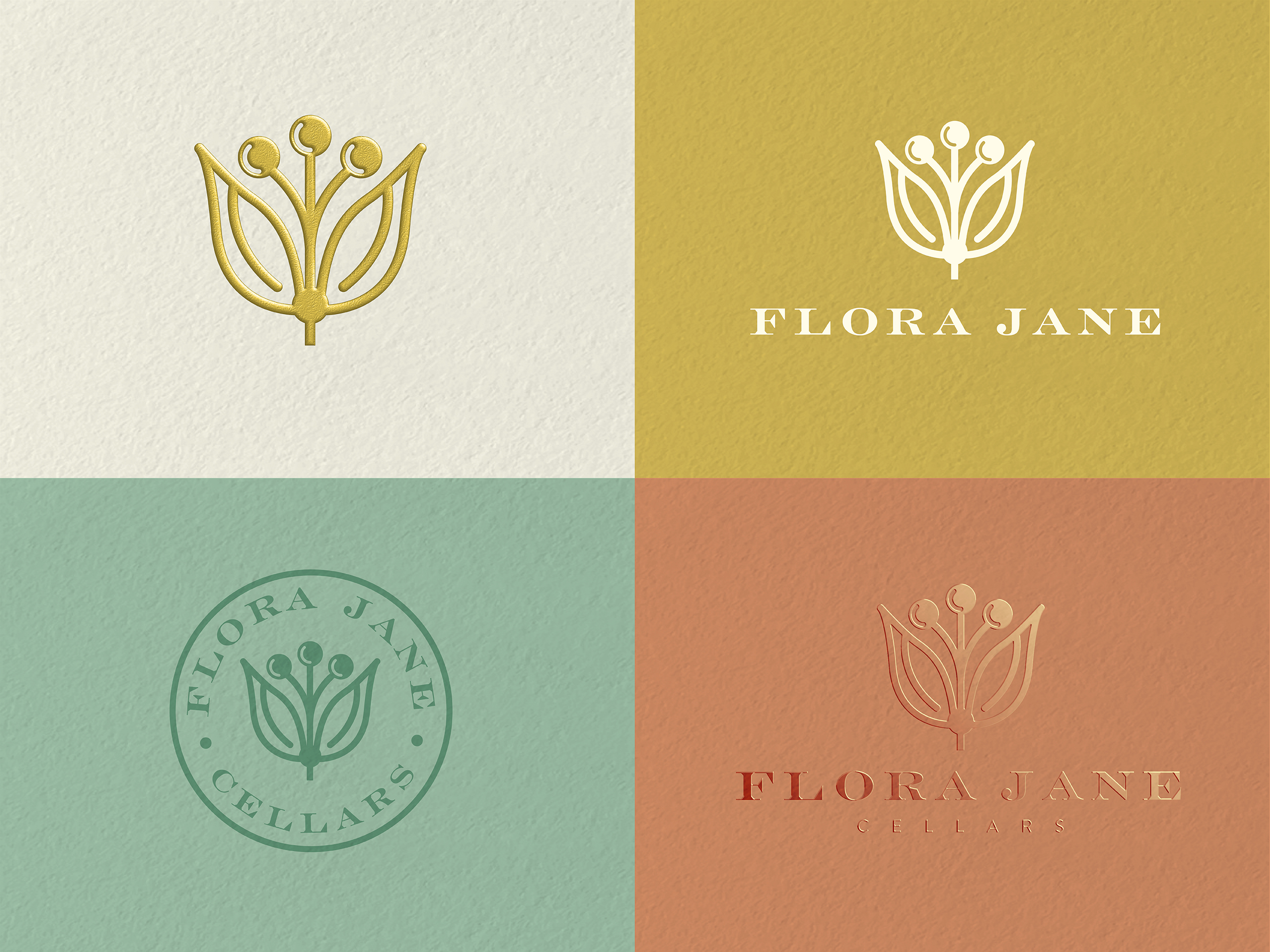
The design solution included labels for a range of wines, as well as options for reserve and icon tier wines, as well as brand elements for marketing purposes.

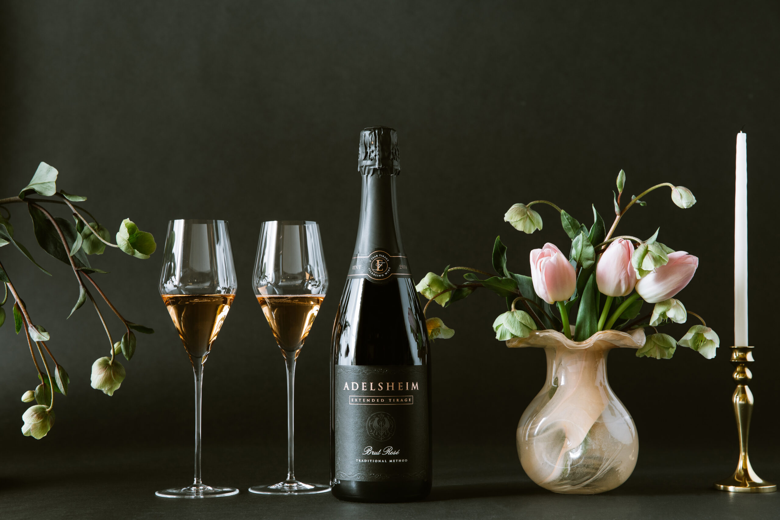
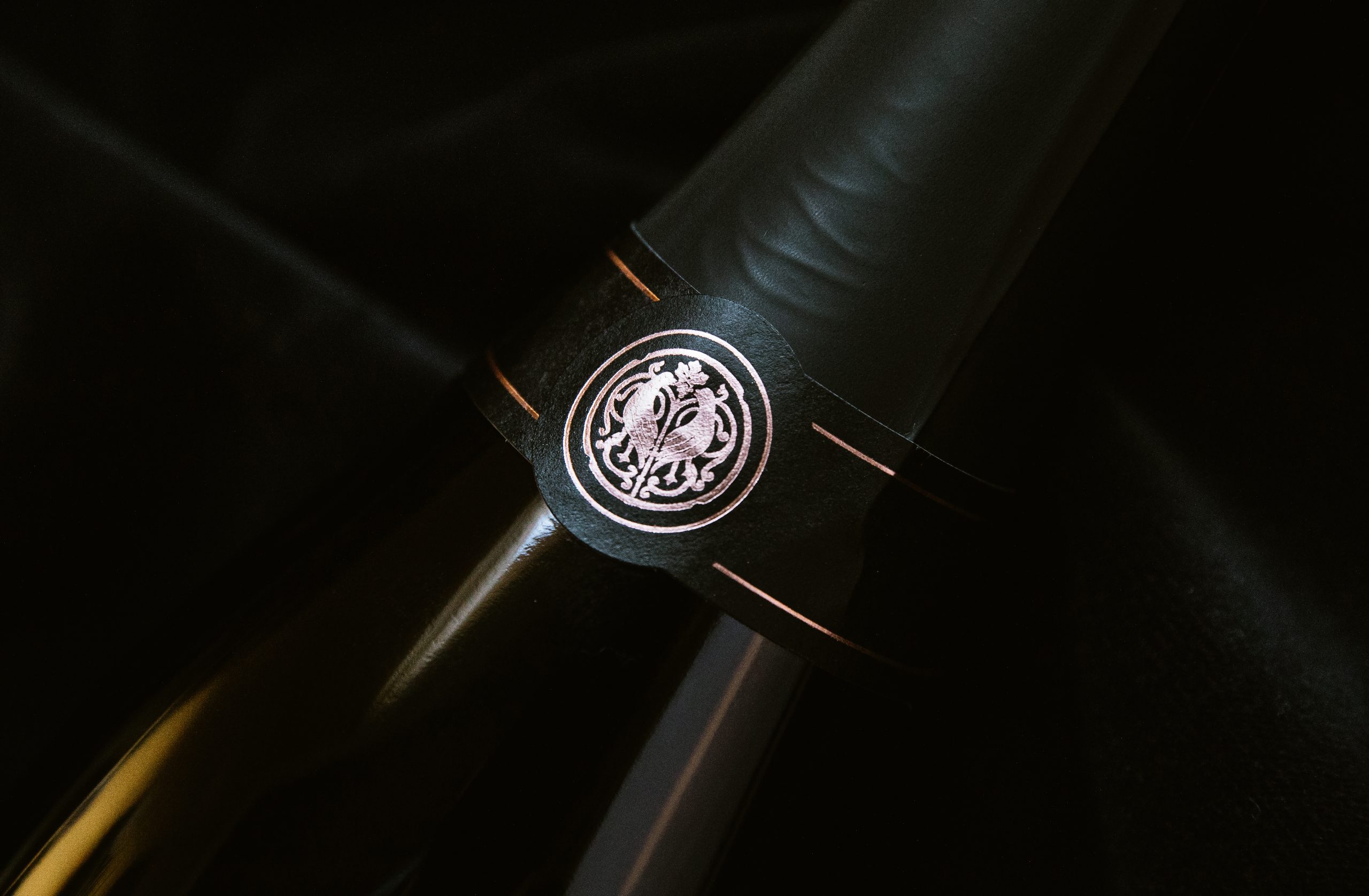
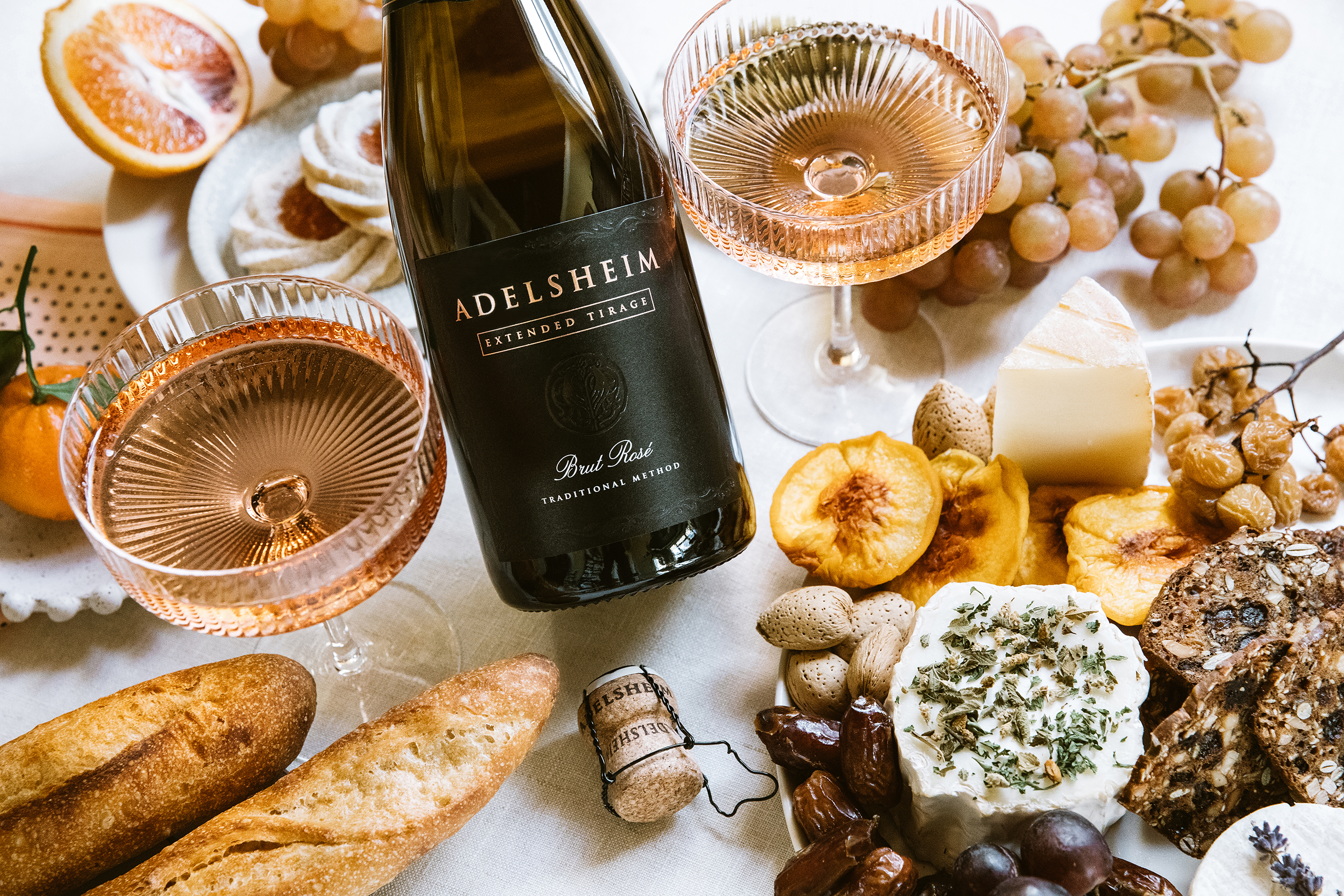
We’ve partnered with Argyle on many projects over the years. From developing new brands and brand extensions, we designed almost every part of their current design system. We ushered in the the new look for Nuthouse and Spirithouse wines, as well as developing new and delicious looking Sparkling Rosé bottlings. We also designed their most elevated offerings, the Extended Tirage wines. Everything from vineyard driven still wines, to holiday promotions.
“Chris has been great to work with. He’s responsive and thoughtful in his approach and always produces solution that are on target. He get’s us.”
Chris Cullina
Argyle Winery (General Manager 2010-2018)

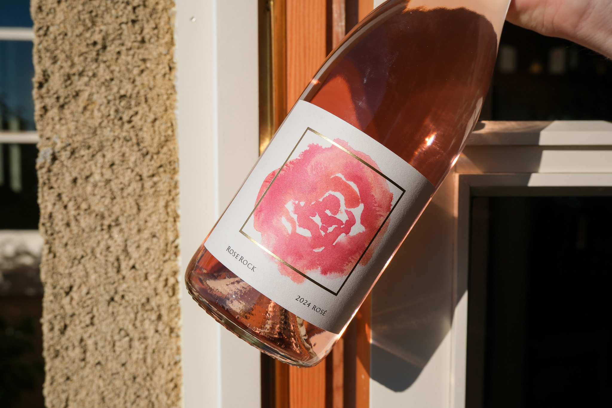
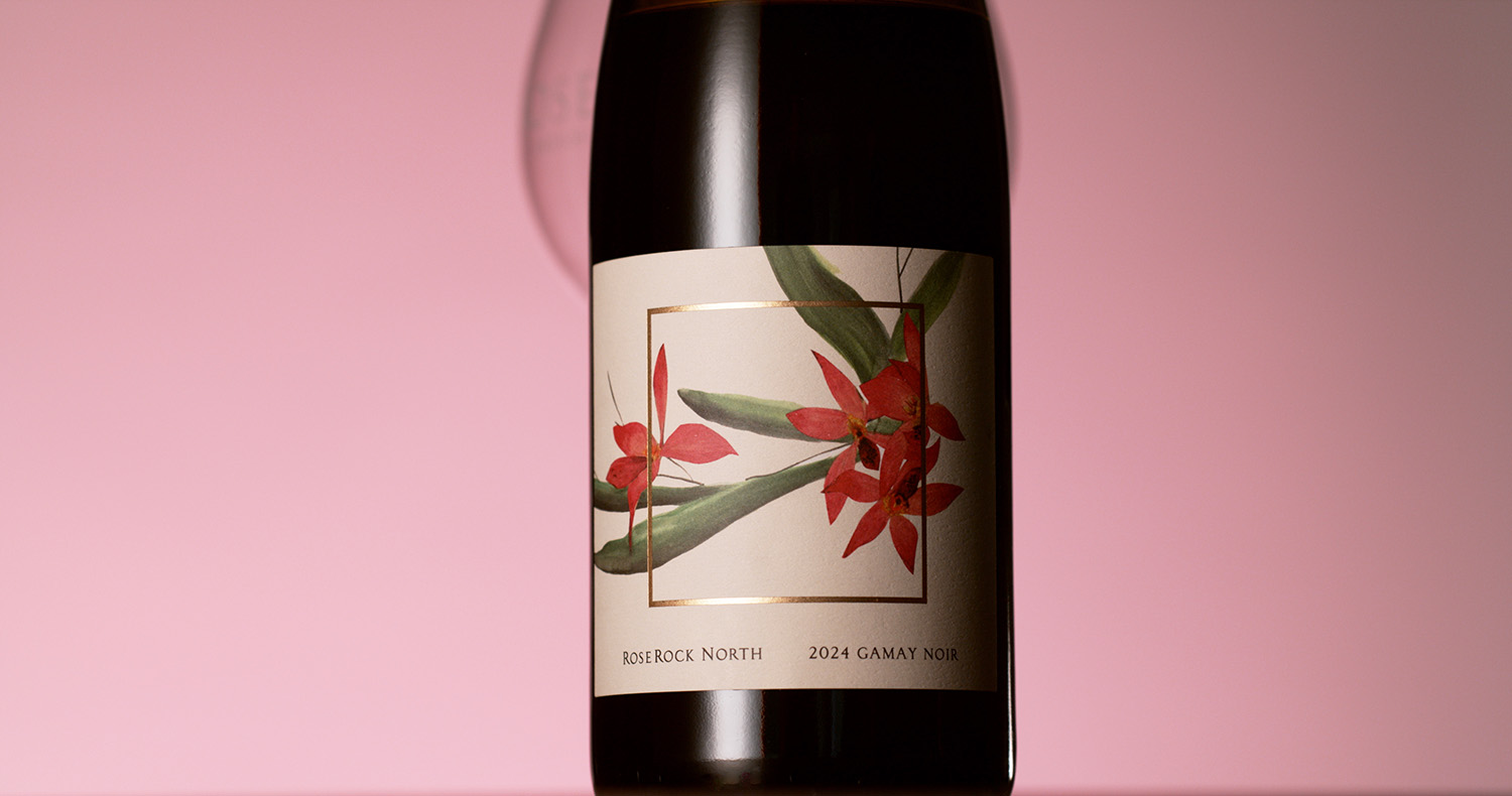
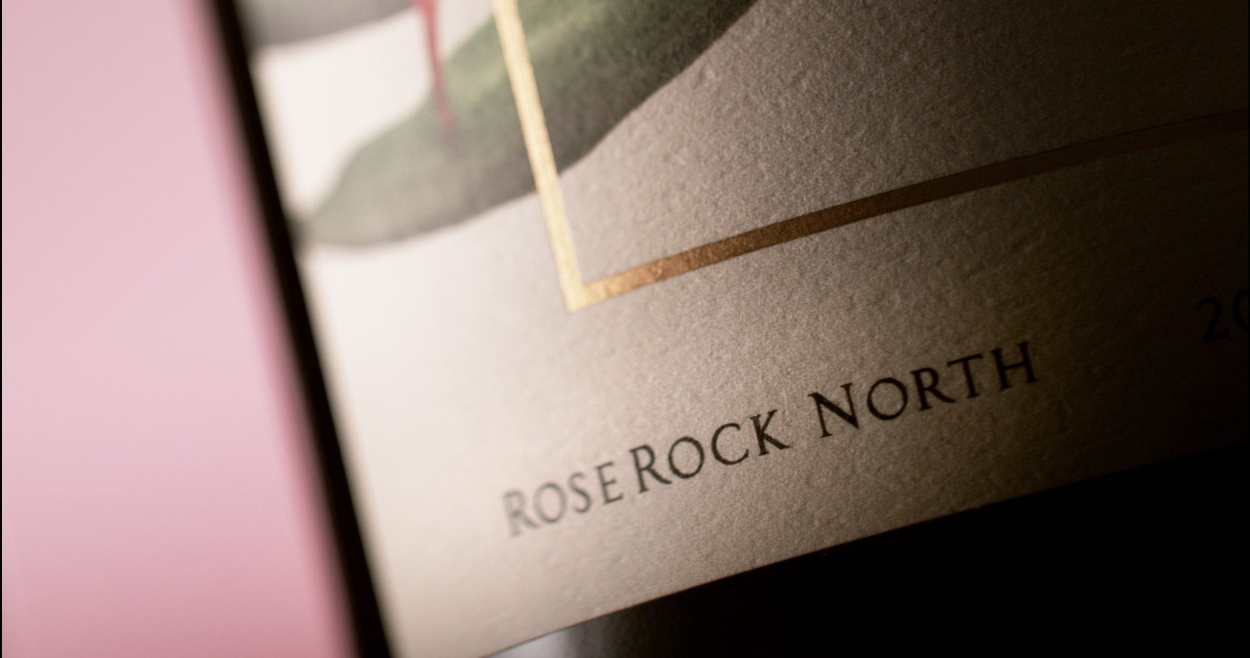
Domaine Drouhin Oregon wanted to give the Rose Rock Vineyard the respect it deserved. So rather than incorporate that vineyard into the DDO brand, they chose to launch a new label to house the wines from this amazing vineyard. Starting with simple “rose” and “rock” illustrations, the design is kept classic and clean, both to align with the tradition of DDO, but also to focus the eye on the central illustration. The labels are printed on a textured, uncoated stock and use minimal embellishments. The reserve tier labels introduce some new artwork, and a gold foil treatment. Overall, the effect is elegant and timeless.

The Mad Violets label design project began with a meeting at a coffee shop. Very quickly, I realized these two individuals were not interested in old world tradition. Their love of farming, their free spirit, and their sense of whimsy overrode my initial inclinations and took the project in a unique direction.
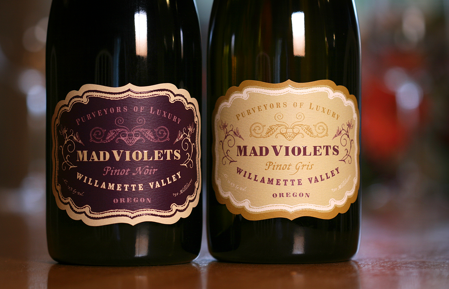
A touch of turn of the century decoupage, along with original drawings by Kelly and Stirling’s daughter, makes for label with old world charm and home spun sensibility. The package was finished with a hand applied neck label instead of a capsule in order to further the hand made message, and to reduce the carbon footprint. The result is a sophisticated and special label that represents the boutique-crafted wine as well as the family perfectly.
“Working with Chris on our many label iterations is always a thrill! The creativity that flows through his brain is truly impressive, not to mention his expertise in the area of wine label design which is priceless when it comes to navigating the TTB waters.”
— Kelly Kidneigh and Stirling Fox
Mad Violets Wine Company