
Westmount was developed for Northwest Wine Company as premium national brand to carry their wines to every corner of the USA. The label is decidedly contemporary including the closure, and is a reflection of the team at NW Wines – younger, outdoorsy and uniquely Northwest.
The full wrap label includes information about the wines including technical information about the vineyard, wine making process, and barreling program details. The clean, modern aesthetic with ample white space, projects a strong visual presence on store shelves and bar shelves alike. It’s a strong confident brand that speaks of confidence and quality.
“Chris is the best- yes, he’s creative, but he’s also brilliant. He’s collaborative and thoughtful and can take a vision of something or an idea and translate it into a tangible work of art that exceeds the original idea or concept. We went to Chris with a name and a feeling, and he created a brand.”
— Robert Mosier
NW Wine Company

The Fueled by Fine Wine half marathon was the first of it’s kind – a grueling 13.1 mile run through the hills and vineyards of Oregon’s Dundee Hills. The race weaves through the flat lands near the river, the climbs up into and through the vineyards and culminating at a feast and and wine tasting of more than 30 wineries.
The logo was inspired by classic, old world label design, and the personality is smart and sport’s minded.
“Chris is extremely talented at creating beautiful and impactful designs. He has great energy and is a delight to work with. I value honesty and feedback as well as creativity in my designers, and he’s not afraid to push back if any of my ideas need improvement.“
— Chris Nagy
Fueled by Fine Wine

J. Wrigley Vineyards is the creation of Jody and Jody Wrigley. Cleared, planted and maintained by John and Jody themselves, J. Wrigley Vineyards is a love story in many ways. It’s an obsession and the story of family members old and new. In short, it’s personal.
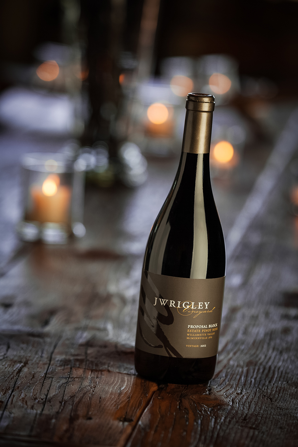
The label design is based on a JW monogram of sorts, and uses a simple, clean layout that lets the type read clearly. The wines are often named for personal details of their journey, including Proposal Block pinot noir. The labels use a natural color palette, organic but austere. The labels employ high end, but reserved print techniques for a high end presentation..
“John and I met Chris of Now Design before we had wine in a bottle! That was 10 years ago and we have never looked elsewhere. Once you have conceptualized your design, Chris masterfully brings your brand to life which saves time on future development projects. We wouldn’t consider anyone else.”
— Jody and Jody Wrigley
JWrigley Vineyards

Helioterra Wines is from urban winemaker extraordinary Ann Hubatch. It’s her flagship premium tier wine brand and encompasses several wines, red and white, main and reserve tiers.
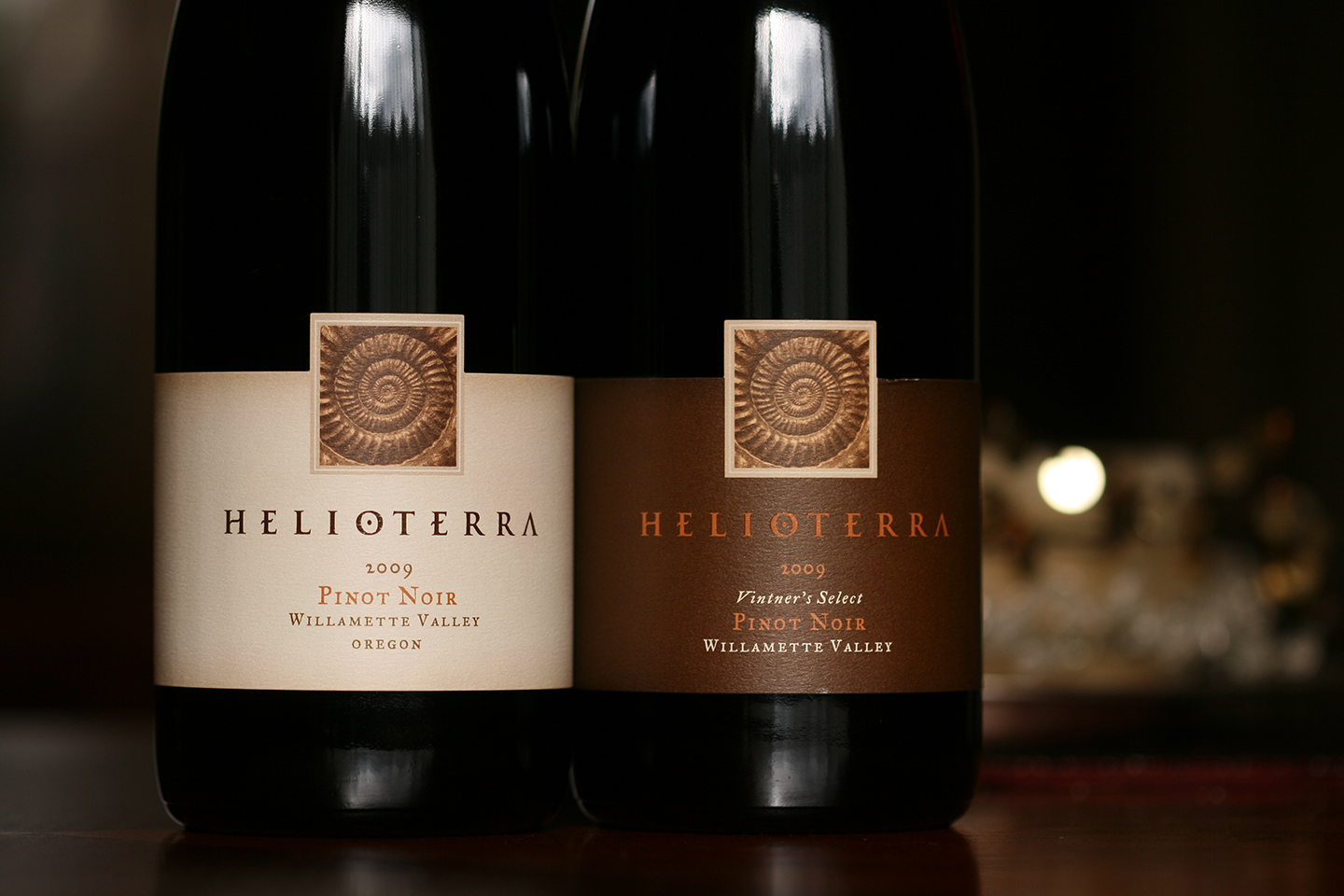
The main symbol of the brand is an embossed photo of an ammonite fossil. The treatment of the brand name is a stylized word mark that also serves as the main logo. The labels are both organic and sophisticated and mirror Anne’s artful yet exacting winemaking process.


