
To celebrate their famed LoneStar Vineyard, Argyle Winery asked us to work on a very special project. A commemorative label and custom wooden box that would be made available to special customers, and revealed during a day long celebration. The label, borrowing from both the name of vineyard, as well as the deep Texas roots of winemaker Rollin Soles, is a custom shape and size, printed on kraft with a high build gloss treatment. The wooden box is branded inside and out, and includes a map of the Willamette Valley as well as details about the wine. All commemorative wine was sold in box sets and each set was hand numbered.
“We worked with Chris on a number of projects ranging from special bottlings like LoneStar to holiday programs, as well as a complete overhaul of our labeling system. He’s creative as well as logical, and brings a lot to the table… including some beautiful design work.”
Chris Cullina
Argyle Winery

Radiant Sparkling Wine is the center of the boutique sparkling wine community in the Willamette Valley. Andrew Davis, the owner and chief bubble maker, started the operation after spending a number years learning the craft from several wineries, including Argyle. While the operation is thriving, he was in need of a logo and visual identity. This logo, based on the muselet cap that tops a sparkling wine, encapsulates the the sparkling wine process, and a little bit of the excitement. The center image, the mushroom shaped cork (prior to insertion into the bottle) is backed with radiating lines representing the effervescence, and energy of bubbles in the bottle.
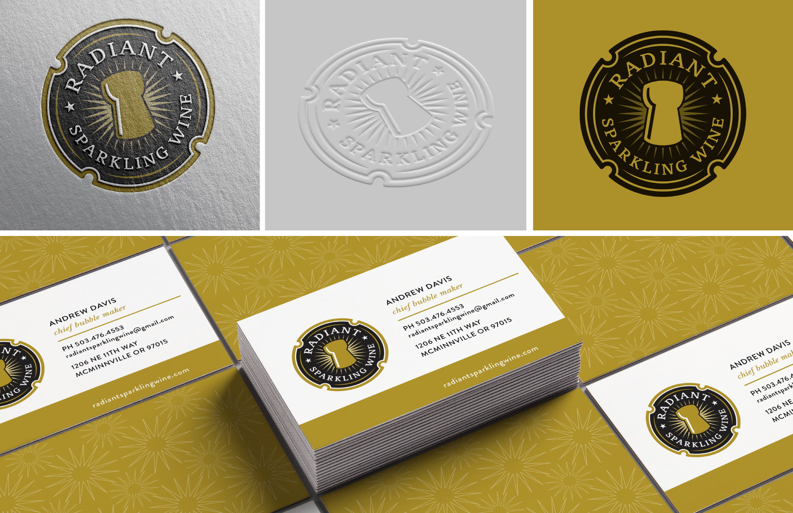
“Working with Chris was a joy. The process was professional, focused, and I love the logo.”
Andrew Davis
Radiant Sparkling Wine

As our studio began working with local breweries, developing new identities, brands and labeling systems, we thought it would be a good idea to understand the beer making process. So we got some home brewing equipment and got busy. We had a lot of fun, made a huge mess and in the end made a beer so good, it really needed it’s own label. The result is the Pour Excuse Brewing Company label. We made several recipes over the years, but the fist batch, No. 1, holds a special place in our heart.
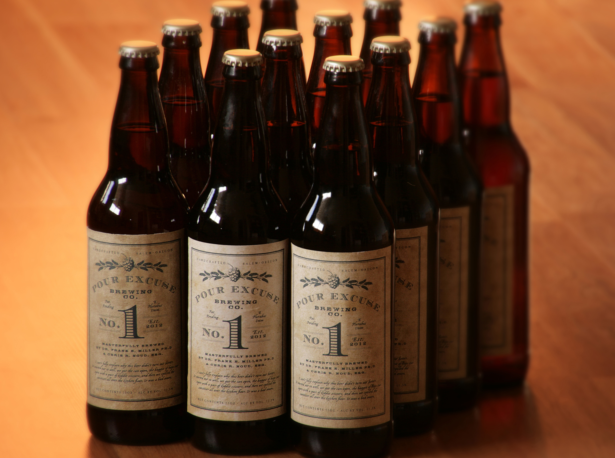
The label is designed with a grungy, garage aesthetic reflecting the hand-made nature of the brew, and the garage where it came to life. Textured paper, in-house printing and hand-labeling ensured an off kilter, imperfect label that reflects it’s roots.

The Mad Violets label design project began with a meeting at a coffee shop. Very quickly, I realized these two individuals were not interested in old world tradition. Their love of farming, their free spirit, and their sense of whimsy overrode my initial inclinations and took the project in a unique direction.
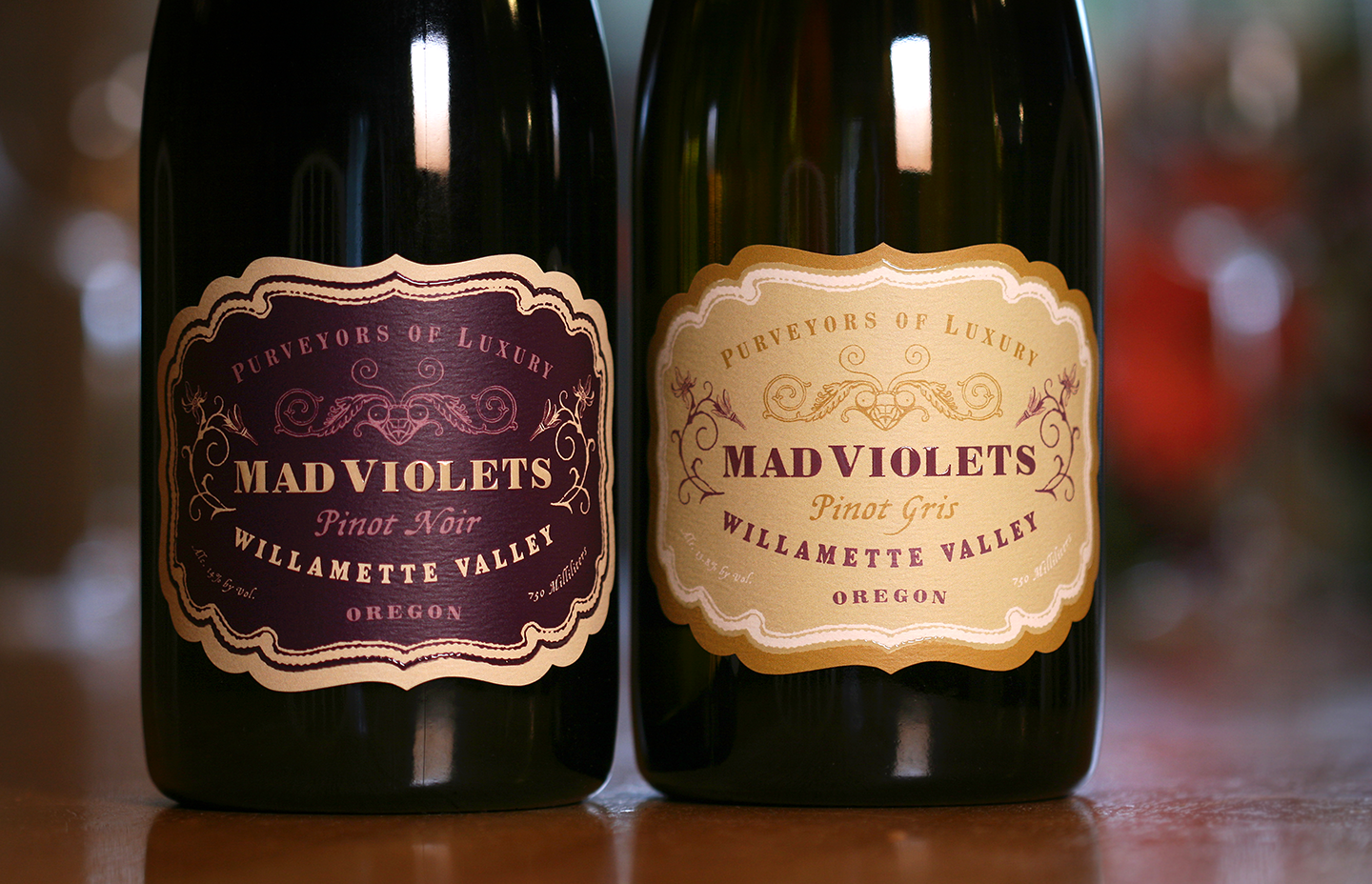
A touch of turn of the century decoupage, along with original drawings by Kelly and Stirling’s daughter, makes for label with old world charm and home spun sensibility. The package was finished with a hand applied neck label instead of a capsule in order to further the hand made message, and to reduce the carbon footprint. The result is a sophisticated and special label that represents the boutique-crafted wine as well as the family perfectly.
“Working with Chris on our many label iterations is always a thrill! The creativity that flows through his brain is truly impressive, not to mention his expertise in the area of wine label design which is priceless when it comes to navigating the TTB waters.”
— Kelly Kidneigh and Stirling Fox
Mad Violets Wine Company

Westmount was developed for Northwest Wine Company as premium national brand to carry their wines to every corner of the USA. The label is decidedly contemporary including the closure, and is a reflection of the team at NW Wines – younger, outdoorsy and uniquely Northwest.
The full wrap label includes information about the wines including technical information about the vineyard, wine making process, and barreling program details. The clean, modern aesthetic with ample white space, projects a strong visual presence on store shelves and bar shelves alike. It’s a strong confident brand that speaks of confidence and quality.
“Chris is the best- yes, he’s creative, but he’s also brilliant. He’s collaborative and thoughtful and can take a vision of something or an idea and translate it into a tangible work of art that exceeds the original idea or concept. We went to Chris with a name and a feeling, and he created a brand.”
— Robert Mosier
NW Wine Company

The Fueled by Fine Wine half marathon was the first of it’s kind – a grueling 13.1 mile run through the hills and vineyards of Oregon’s Dundee Hills. The race weaves through the flat lands near the river, the climbs up into and through the vineyards and culminating at a feast and and wine tasting of more than 30 wineries.
The logo was inspired by classic, old world label design, and the personality is smart and sport’s minded.
“Chris is extremely talented at creating beautiful and impactful designs. He has great energy and is a delight to work with. I value honesty and feedback as well as creativity in my designers, and he’s not afraid to push back if any of my ideas need improvement.“
— Chris Nagy
Fueled by Fine Wine

J. Wrigley Vineyards is the creation of Jody and Jody Wrigley. Cleared, planted and maintained by John and Jody themselves, J. Wrigley Vineyards is a love story in many ways. It’s an obsession and the story of family members old and new. In short, it’s personal.
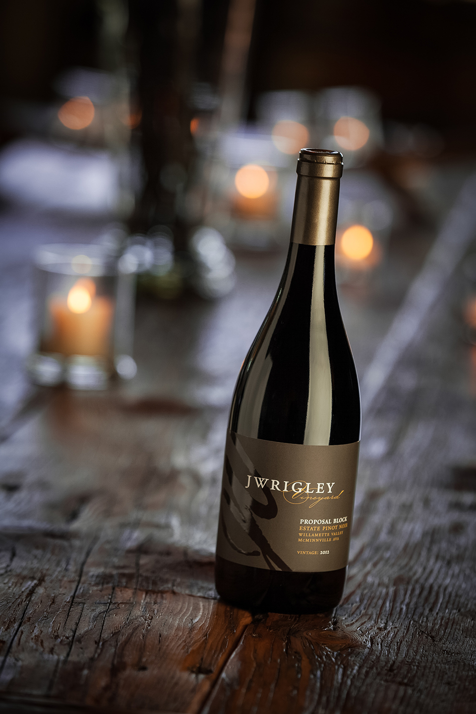
The label design is based on a JW monogram of sorts, and uses a simple, clean layout that lets the type read clearly. The wines are often named for personal details of their journey, including Proposal Block pinot noir. The labels use a natural color palette, organic but austere. The labels employ high end, but reserved print techniques for a high end presentation..
“John and I met Chris of Now Design before we had wine in a bottle! That was 10 years ago and we have never looked elsewhere. Once you have conceptualized your design, Chris masterfully brings your brand to life which saves time on future development projects. We wouldn’t consider anyone else.”
— Jody and Jody Wrigley
JWrigley Vineyards

Helioterra Wines is from urban winemaker extraordinary Ann Hubatch. It’s her flagship premium tier wine brand and encompasses several wines, red and white, main and reserve tiers.
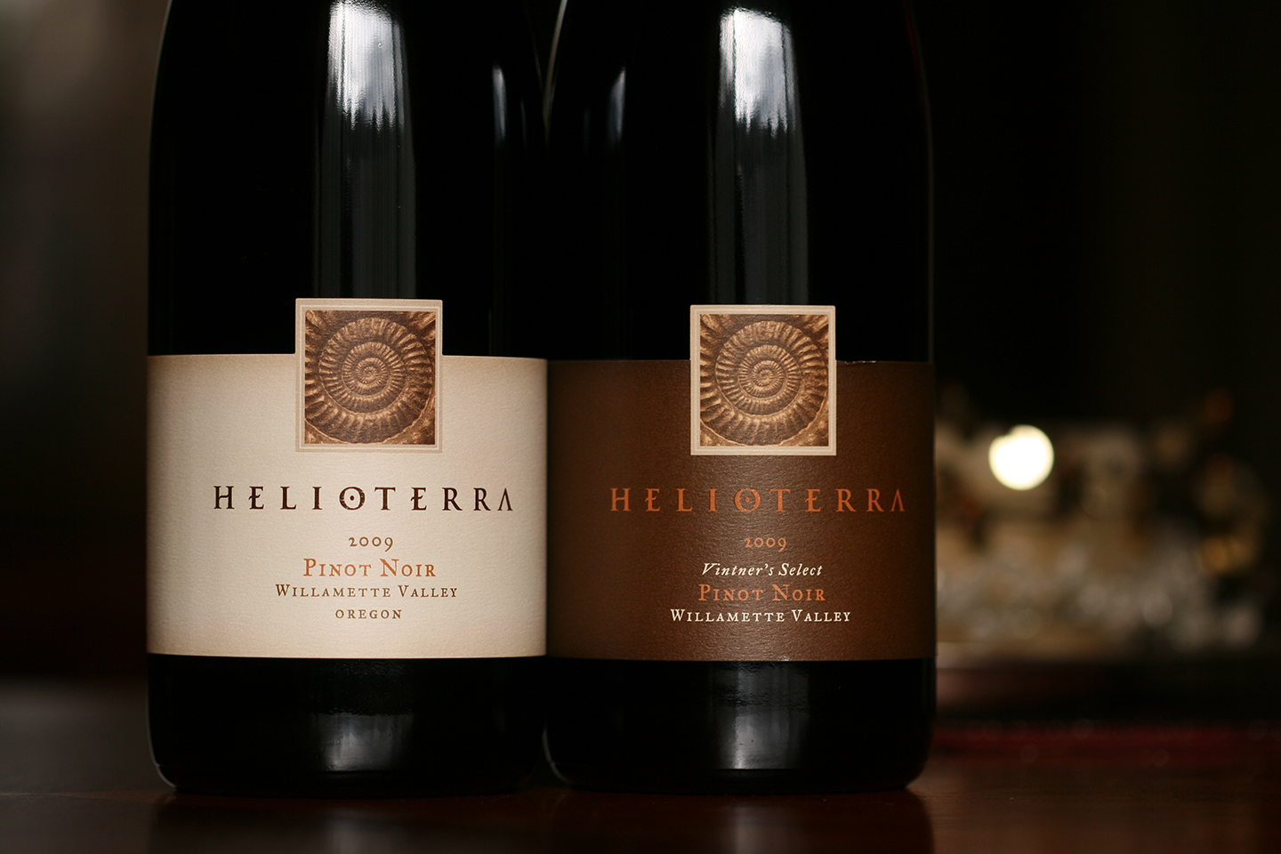
The main symbol of the brand is an embossed photo of an ammonite fossil. The treatment of the brand name is a stylized word mark that also serves as the main logo. The labels are both organic and sophisticated and mirror Anne’s artful yet exacting winemaking process.


