
New Client Alert! Arron Bell and Tracey Rogers are the new team behind the rebirth of historic Redhawk Vineyard, and the launch RH Estate Wines. We were lucky to have the opportunity to work with them on a full rebrand of Redhawk Labels, as well as a reimagining of the famous Grateful Red label package. We also developed a new RH Estate brand for the new overarching company, with packaging and labels to follow next year.

Radiant Sparkling Wine is the center of the boutique sparkling wine community in the Willamette Valley. Andrew Davis, the owner and chief bubble maker, started the operation after spending a number years learning the craft from several wineries, including Argyle. While the operation is thriving, he was in need of a logo and visual identity. This logo, based on the muselet cap that tops a sparkling wine, encapsulates the the sparkling wine process, and a little bit of the excitement. The center image, the mushroom shaped cork (prior to insertion into the bottle) is backed with radiating lines representing the effervescence, and energy of bubbles in the bottle.
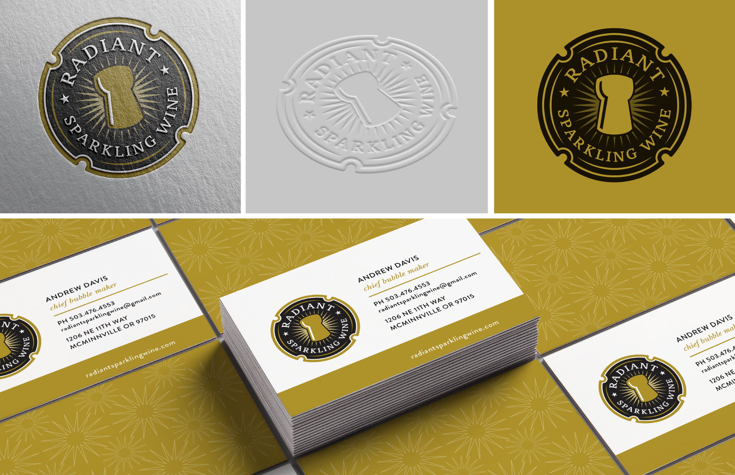
“Working with Chris was a joy. The process was professional, focused, and I love the logo.”
Andrew Davis
Radiant Sparkling Wine

A young couple had the dream of starting a tavern, tap house and wine bar in Newberg, Oregon. They had a vision of rich colors, aged wood furniture, lush textures with a sprinkle of art deco mixed in. Our challenge was to develop a logo and simple brand that reflected this aesthetic. I’m not gonna sugar coat it… I think we nailed it.
In addition to reflecting the rich, vintage ethos of the place, the logo had to be simple enough to work on glasses, coasters, tees, etc., so it needed to be strong yet simple. Our solution is a versatile logo that has a subtle echo of Art Deco typography, with a modern sense of play. The logo conveys a sense of inclusion to the clientele, and has a slightly up-market position. Perfect for a wine town.

Who wouldn’t want to work on a project that combines wine, cute dogs, and the Bahamas? That’s just what this client is all about. The name is derived from the Royal Bahamian Potcake breed of dog, unique to the Bahamaian Islands. The winery has a two-fold mission – produce great wine and help this special breed by providing care and forever homes. We developed a new logo and identity system, as well as a full packaging system including labels, boxes, corks,etc.
We also developed a secondary label for a No Collars offshoot brand. Named after their boat, the No Collars brand is an approachable, easy drinking wine that’s designed to reflect the bahamian vibe… relaxed, laid back, and fun.

To celebrate their famed LoneStar Vineyard, Argyle Winery asked us to work on a very special project. A commemorative label and custom wooden box that would be made available to special customers, and revealed during a day long celebration. The label, borrowing from both the name of vineyard, as well as the deep Texas roots of winemaker Rollin Soles, is a custom shape and size, printed on kraft with a high build gloss treatment. The wooden box is branded inside and out, and includes a map of the Willamette Valley as well as details about the wine. All commemorative wine was sold in box sets and each set was hand numbered.
“We worked with Chris on a number of projects ranging from special bottlings like LoneStar to holiday programs, as well as a complete overhaul of our labeling system. He’s creative as well as logical, and brings a lot to the table… including some beautiful design work.”
Chris Cullina
Argyle Winery

Johnny Brose and his wife Courtney wanted to start a wine brand that was inspired by and honored family. The brand is named after Courtney’s Grandmother, and the logo was inspired by an old business card of Johnny’s Grandfather – a flower wholesaler in the 1960’s. The Design is simple and clean, and reflects the ethos of Johnny and Courtney – “Serious Wines For Not So Serious People.”
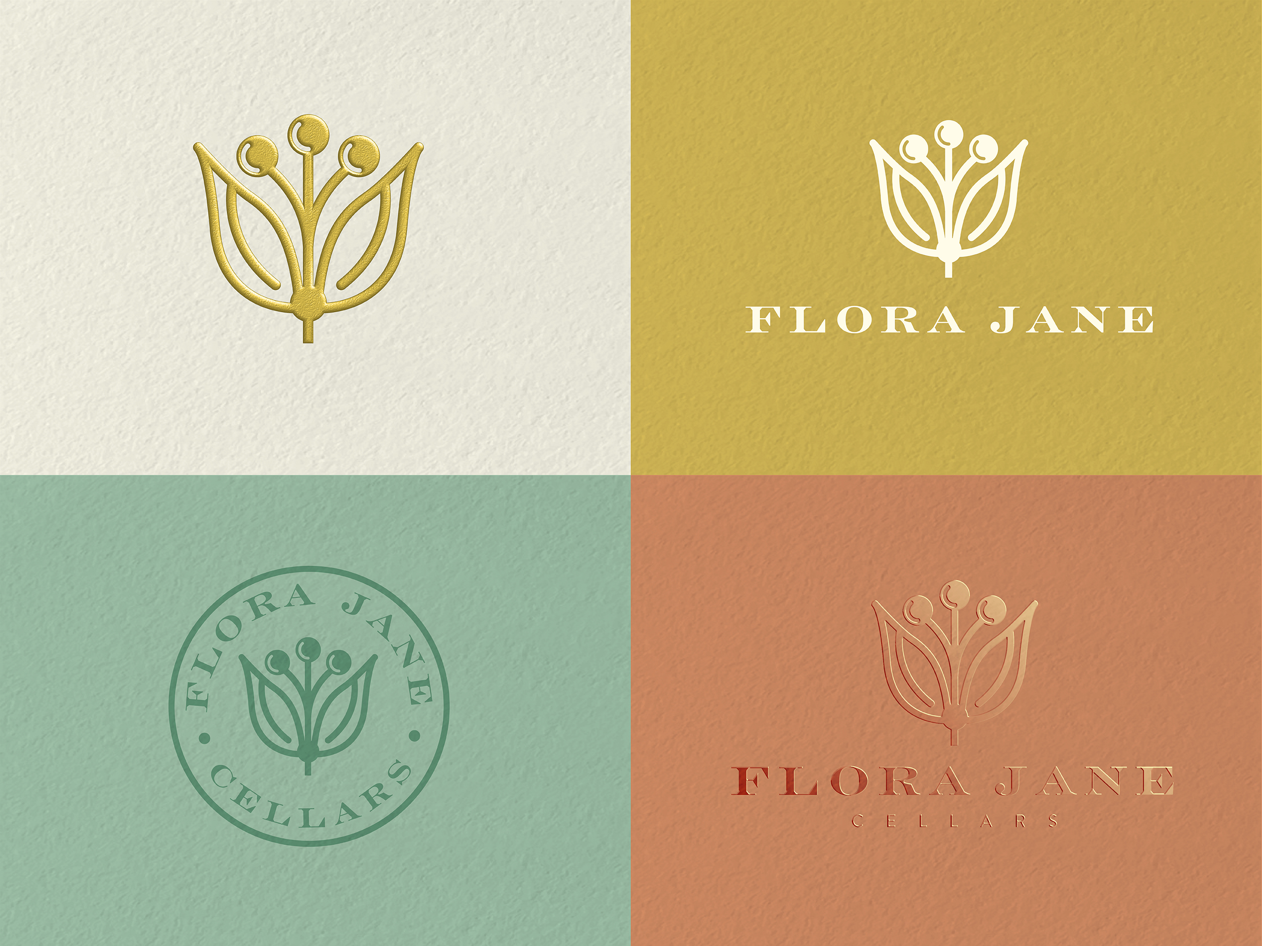
The design solution included labels for a range of wines, as well as options for reserve and icon tier wines, as well as brand elements for marketing purposes.

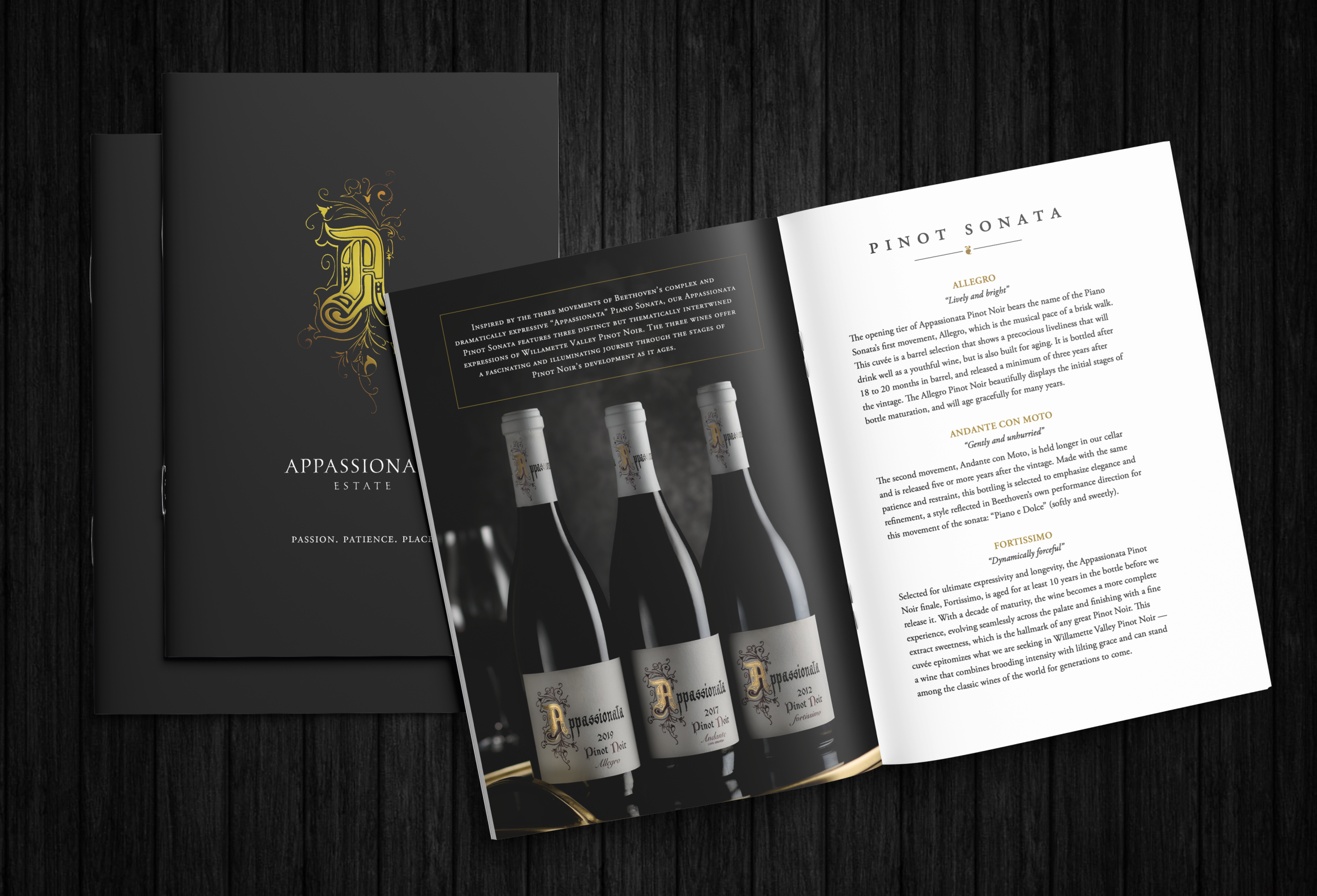
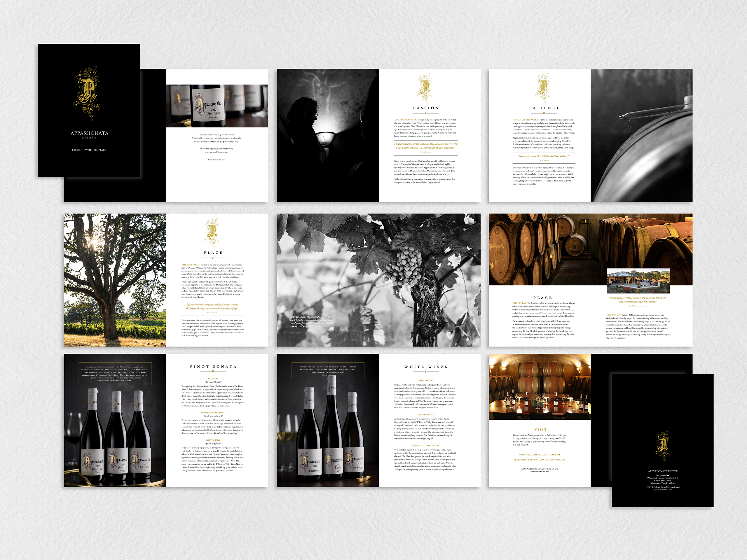
Appassionata Estate in the Chehalem Mountains is a special place, and has a unique wine program. The wines are built for aging and released only when ready, some age for 1o years. The winery needed a way to tell that story more fully, and in a way that communicated the premium position in the market. We developed this booklet as way to do just that. With a mix of black and white and color photography, and accented with metallic gold throughout, this piece screams, or maybe whispers, “elegance.”
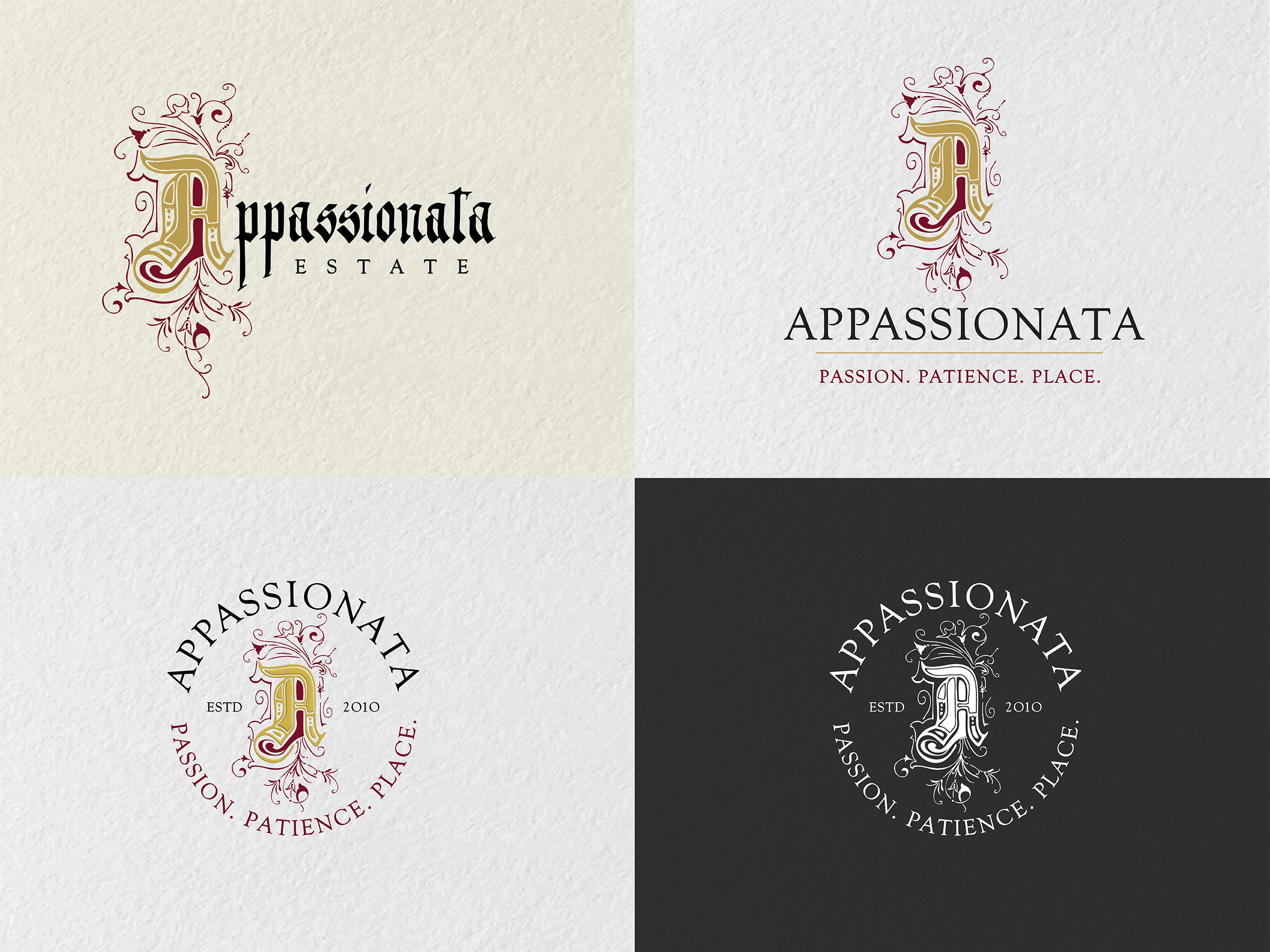
The original design of the winery includes an initial cap A, that is inspired by old illuminated manuscripts. While evocative and beautifully detailed, it can be hard to reproduce. We were also tasked with providing some options that were a little easier to work with. What followed was a series of logo variations that allowed for flexibility in the marketing of the winery.

As our studio began working with local breweries, developing new identities, brands and labeling systems, we thought it would be a good idea to understand the beer making process. So we got some home brewing equipment and got busy. We had a lot of fun, made a huge mess and in the end made a beer so good, it really needed it’s own label. The result is the Pour Excuse Brewing Company label. We made several recipes over the years, but the fist batch, No. 1, holds a special place in our heart.
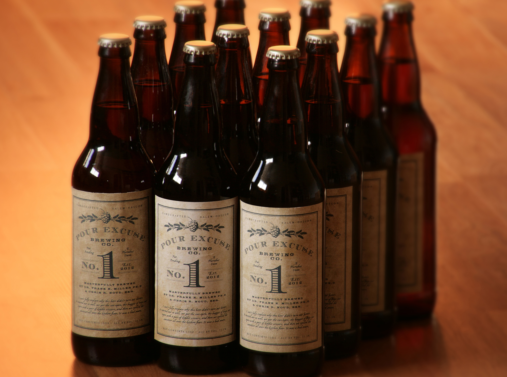
The label is designed with a grungy, garage aesthetic reflecting the hand-made nature of the brew, and the garage where it came to life. Textured paper, in-house printing and hand-labeling ensured an off kilter, imperfect label that reflects it’s roots.

The Mad Violets label design project began with a meeting at a coffee shop. Very quickly, I realized these two individuals were not interested in old world tradition. Their love of farming, their free spirit, and their sense of whimsy overrode my initial inclinations and took the project in a unique direction.
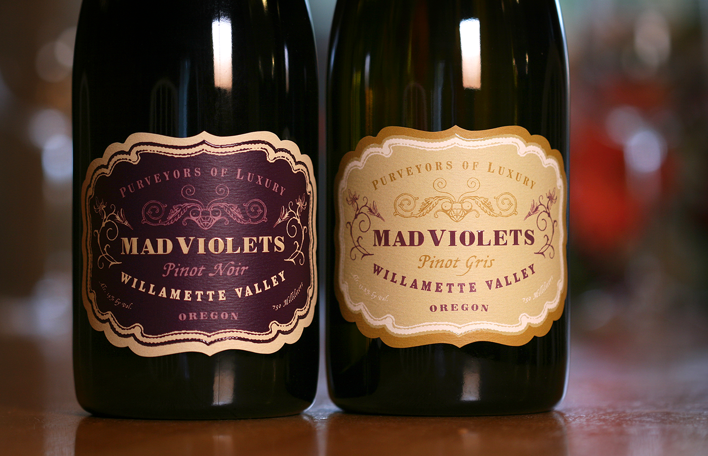
A touch of turn of the century decoupage, along with original drawings by Kelly and Stirling’s daughter, makes for label with old world charm and home spun sensibility. The package was finished with a hand applied neck label instead of a capsule in order to further the hand made message, and to reduce the carbon footprint. The result is a sophisticated and special label that represents the boutique-crafted wine as well as the family perfectly.
“Working with Chris on our many label iterations is always a thrill! The creativity that flows through his brain is truly impressive, not to mention his expertise in the area of wine label design which is priceless when it comes to navigating the TTB waters.”
— Kelly Kidneigh and Stirling Fox
Mad Violets Wine Company

We partnered with Ten Pin Brewing in Moses Lake Washington to develop a labeling system for the start up brewery. Ten Pin is an offshoot business venture that evolved out of the family owned bowling alley of the same name. We designed the main structure of the label based on the X (a strike in bowling score keeping) and gave each product it’s own color and texture.
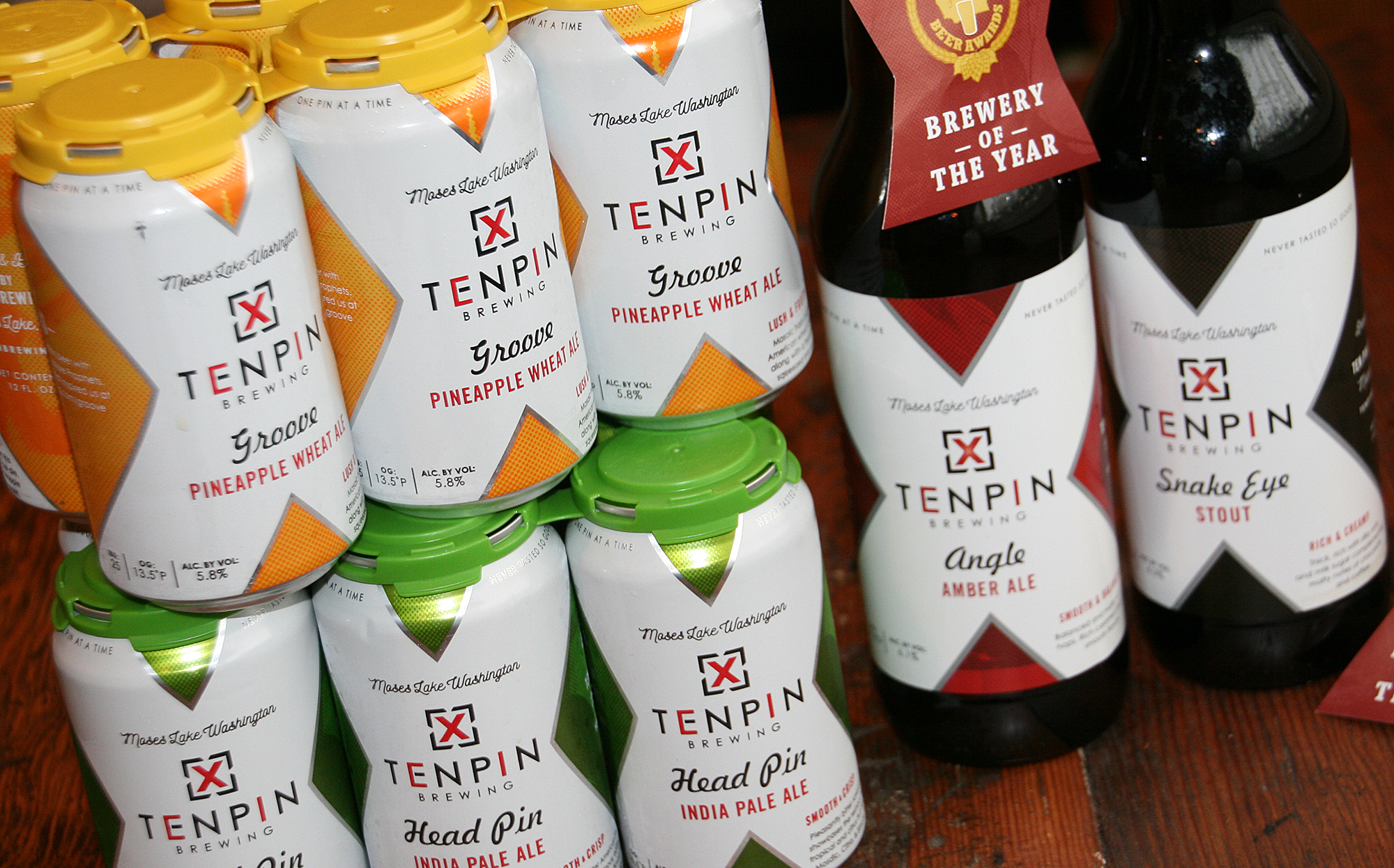
The font selection is a deliberate marriage of modern and retro, reflecting not only traditional bowling culture but also the family business that started in the 1950’s. The product list has grown to several products in glass and label, as well as a core set of beers they offer in cans. Ten Pin has a culture of experimentation, so has an almost constant rotation of new products on tap at their Moses Lake tasting room.


